
A New JA ERA Metric
I've finally tweaked JA ERA to fit the predictive stats we like the most here at MLB Data Warehouse


In May of this year (2025), I introduced JA ERA. This was really not a huge development. As I explained in that linked post, it was just my own copy of SIERA. Same inputs with slightly different weights and intercept, so JA ERA and SIERA did not exactly match, but the order would be almost exactly the same (meaning you’d see essentially the same top 10 when looking at both stats).
The point of doing it wasn’t to act like I did something special; it was just to easily work it into the Tableau Dashboards. Programming it myself meant I could put it right there on all the different pitcher tabs, and the numbers would adjust to whatever filters you were putting on.
But since the beginning, I’ve wanted to make some slight adjustments to it. I wanted this number to reflect SwStr% and Ball% rather than K% and BB%. I really like seeing the comparisons between SwStr% and K% as well as between Ball% and BB%, because a lot of times there are mismatches there that tend to correct.
If you have a 14% SwStr% and a 19% K% after five starts, something weird has been going on. You should have more strikeouts with that high of a swinging strike rate. And the same with BB% and Ball%. A 36% Ball% implies about the league average 8% BB%. But sometimes you’ll see guys in small samples go for a solid Ball% (say 37%) but a really high walk rate (12%). Those guys are very likely to bring the BB% down. Ball% and SwStr% stabilize more quickly than BB% and K%, so they’re a bit more useful in small samples.
But at the same time, season N K% will predict season N+1 K% better than season one SwStr%. So the tweaks I’m talking about will be better used in small sample situations.
So I’m introducing a new metric, but not replacing the old one.
THE RENAMED JA ERA
This will be confusing to people who open the dashboards and see things have changed. So I hope you all read this. JA ERA IS NOW CALLED JA SIERA on the dashboards. Since it’s modeled directly after SIERA, it makes sense for that to be shown in the league.
THE NEW ONE WILL BE CALLED JA ERA. So the thing you’re used to seeing, you will now see as “JA SIERA”, and the “JA ERA” column will be this new tweaked metric.
It’s generally the same, but it changes the inputs from:
K% → SwStr%
BB% → Ball%
FB% → Well Hit FB%
And I have changed the scaling on both so they more closely fit what you usually see with the other ERA indicators. The average of both is 3.80.
The FB% input into JA ERA has never counted pop-ups. But not counting pop-ups still leaves a ton of super weakly hit fly balls that came on very good pitches where the hitter couldn’t do anything but pathetically fly out. So I’ve added a requirement to only count the decently-struck fly balls against the pitcher.
What you have now is a mixture of SwStr%, Ball%, and well-hit fly balls. It’s all weighted how SIERA is weighted, and it’s fit to look like a typical ERA number.
WHERE YOU’LL FIND IT
I’m showing you BOTH on the main pitcher tab and the pitcher profile tab. Those are the two spots I live my life on the main Tableau dashboard.
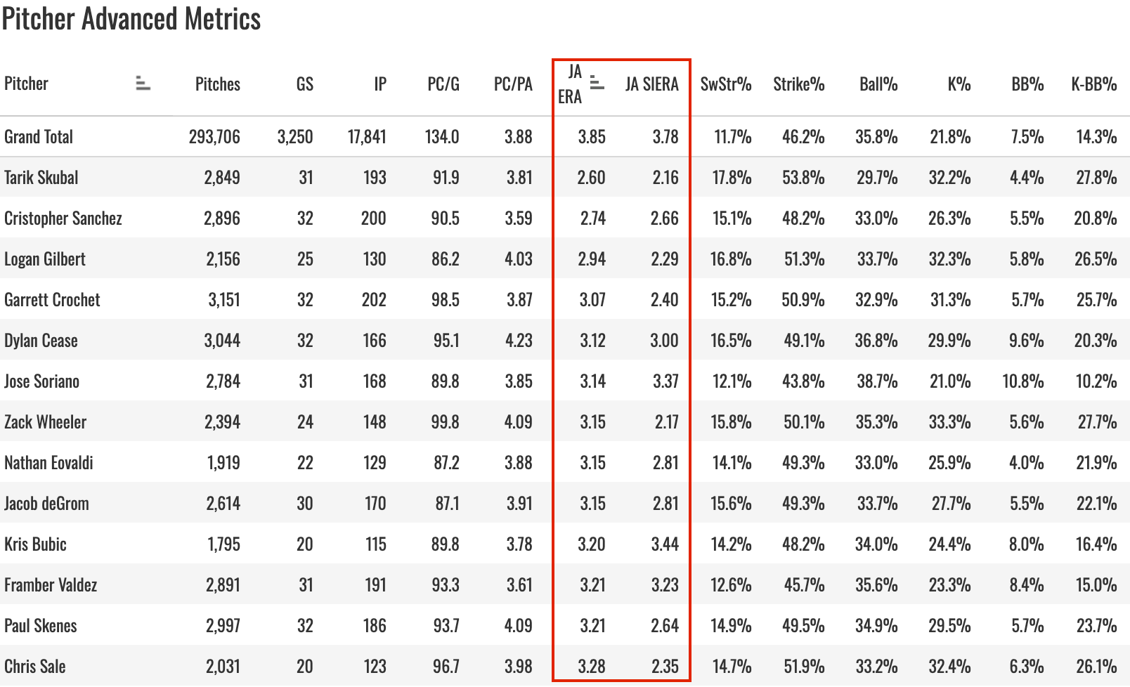
You can see a pretty big difference there with a guy like Logan Gilbert. His 2.94 JA ERA is well above his 2.29 JA SIERA. That’s because he got hit pretty hard last year. His four-seamer gave up a .331 xwOBA, and his slider was at .346. He gave up 20 homers in 25 starts, and he earned most of those (1.4 HR/9). So he's not getting nearly as many of those fly balls forgiven as other guys, hence the bigger difference.
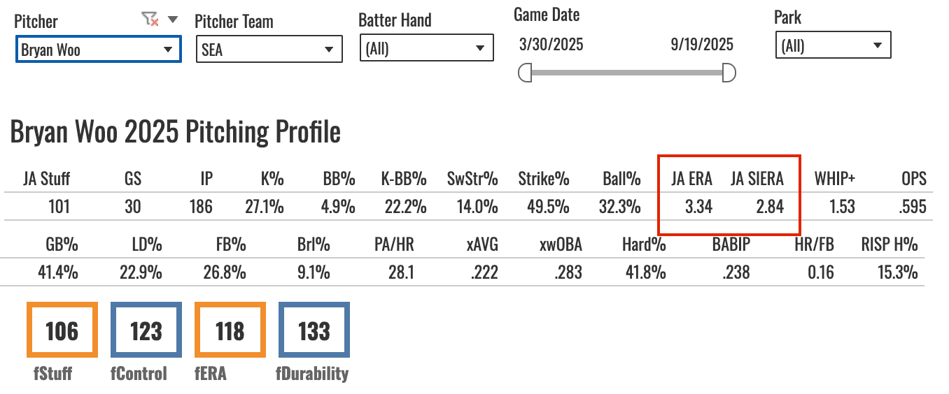
You’ll also find these figures on the Pitcher Profile tab.
Logan Webb is a pretty good example on this one. His 26.2% K% outpaced his 11.4% SwStr%. That’s a below-average SwStr% with a well above-average K%. Webb can do that stuff, so typically you don’t want to punish him for it because he’s been getting called strikes so consistently for years. But with most guys, you should be pretty skeptical about such a combo of stats.
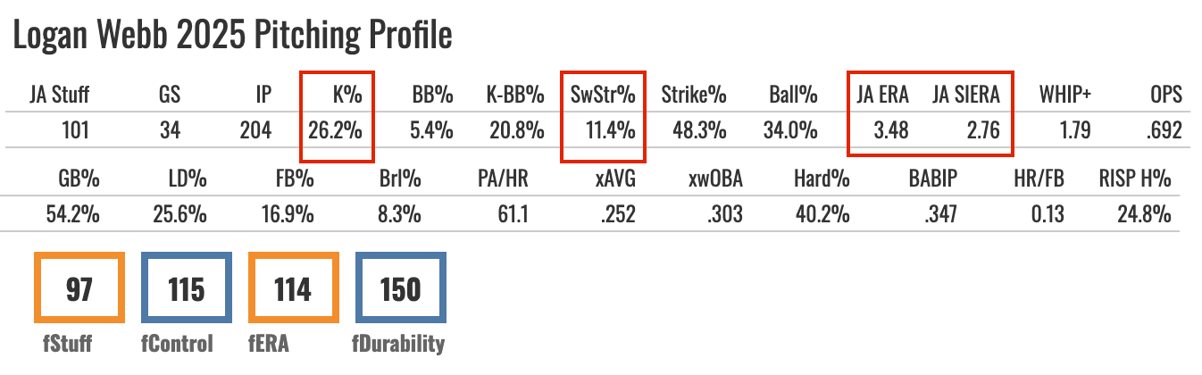
In this case, you see the JA ERA way up at 3.48 while the JA SIERA sparkles at 2.76. JA ERA is viewing him as a below-average K% pitcher while JA SIERA does not. In the case of Webb, JA SIERA is probably the better pick because we know of the track record. But with a smaller sample size and a lesser-known pitcher, my prediction for the future would be a declining K%, and JA's ERA would now reflect that.
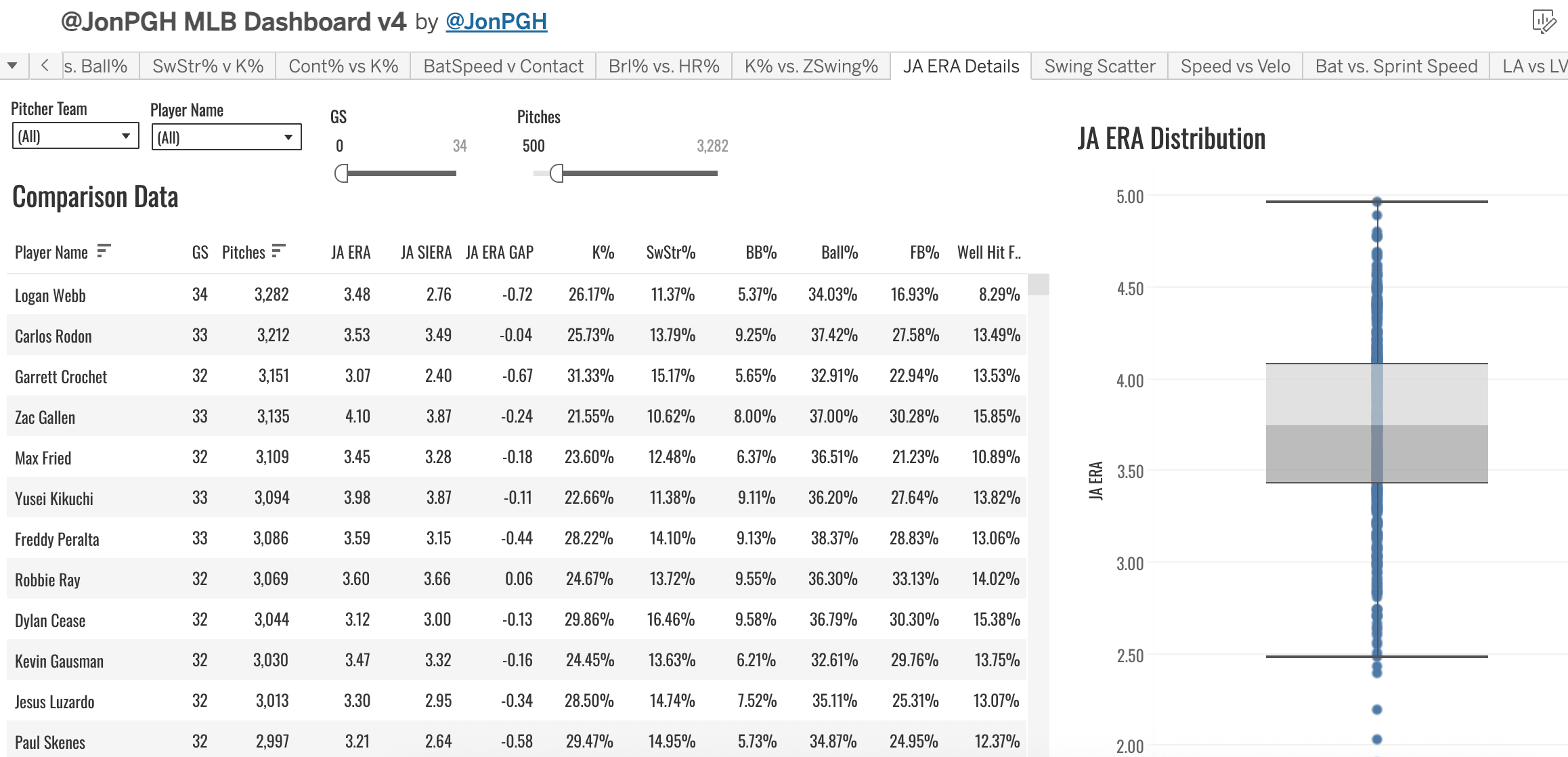
There’s also a new tab on the dashboard called JA ERA Details. This show you the comparison between JA ERA and JA SIERA, as well as the calculated difference, and all of the different inputs for both.
To take Webb again:
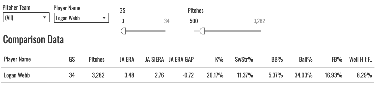
This shows you that 72-point gap between the two, and then it quickly shows you the K% and SwStr% side-by-side so you can kinda tell where the difference is coming from.
There’s also a BOX AND WHISKER plot to the right. That shows you the distribution of JA ERA.
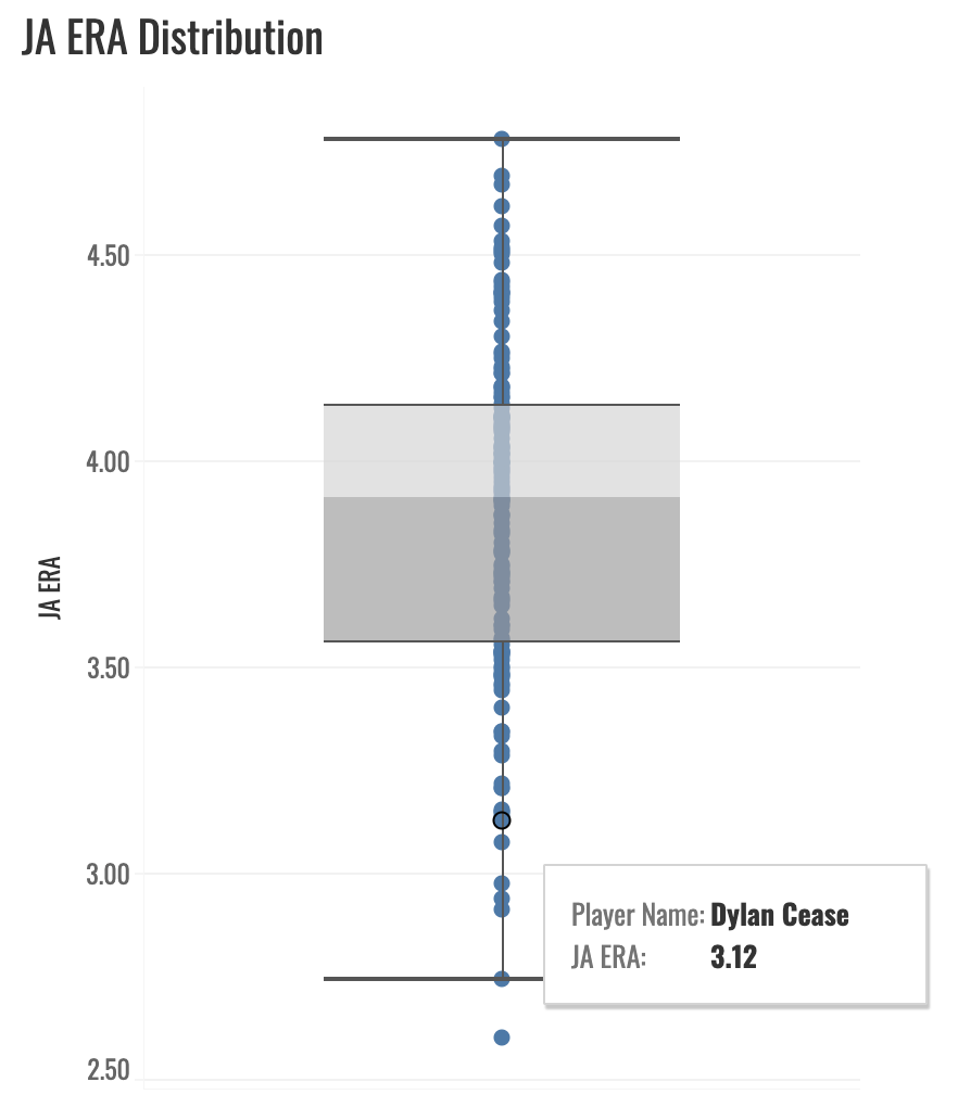
You can see where most values fall, where the outliers are, and you can hover over each dot to see which pitcher it represents.
I’ve found a few sleepers for 2026 already on this stuff. In fact, one pitcher I was writing up today inspired me to finally take the time to bang this out. More to come on that…
For now, tinker around with yourselves on that main Tableau dashboard (link in Resource Glossary for paid subs only) and see what you can find. Let me know if you see any weird stuff or have any questions!