
Pitcher Eval with the Main Dashboard
A Written Demo of Some of the Features of the MLB DW Main MLB Tableau Dashboard

I probably don’t promote the Tableau dashboards as much as I should. They’re decent selling points for me, I think, and they’ve turned into really awesome tools for fantasy baseball player evaluation.
No player type is more fun to evaluate than starting pitcher, so I figured I’d give you a written tutorial on how I personally go about evaluating pitchers with the main Tableau dashboard.
The links to the dashboards (there are several) are available to paid subs through the Resource Glossary page.
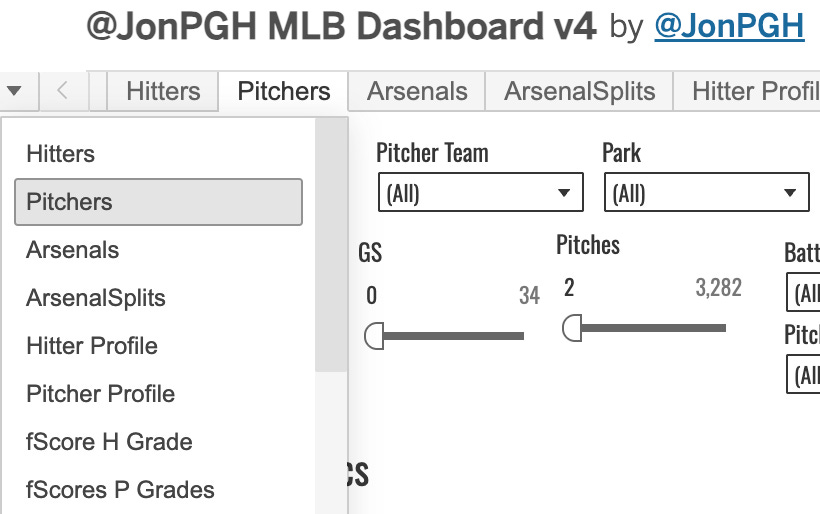
The Main Pitchers Tab
After you load that thing up, you see an overwhelming number of tabs/pages on there. It’s way too much to get through in one sitting. But every tab has been useful for me at some point in time, which is why it exists! But certainly, some are much more useful than others.
So we start with the Pitchers tab. It was the second one ever created, but it changes all the time as my preference for stats changes and as I add new things.
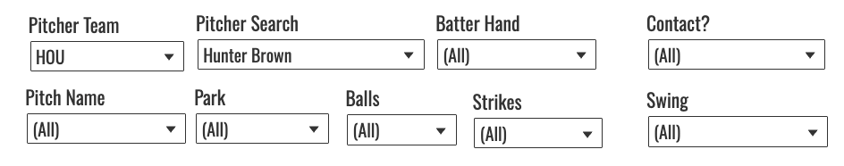
You’ve got a bunch of dials at the top of the page, which make the thing really powerful. You can see how these guys performed in all sorts of different situations.
Let’s take the fun example of Hunter Brown to learn with. I set the pitcher team to HOU, and then we have some numbers to look at.
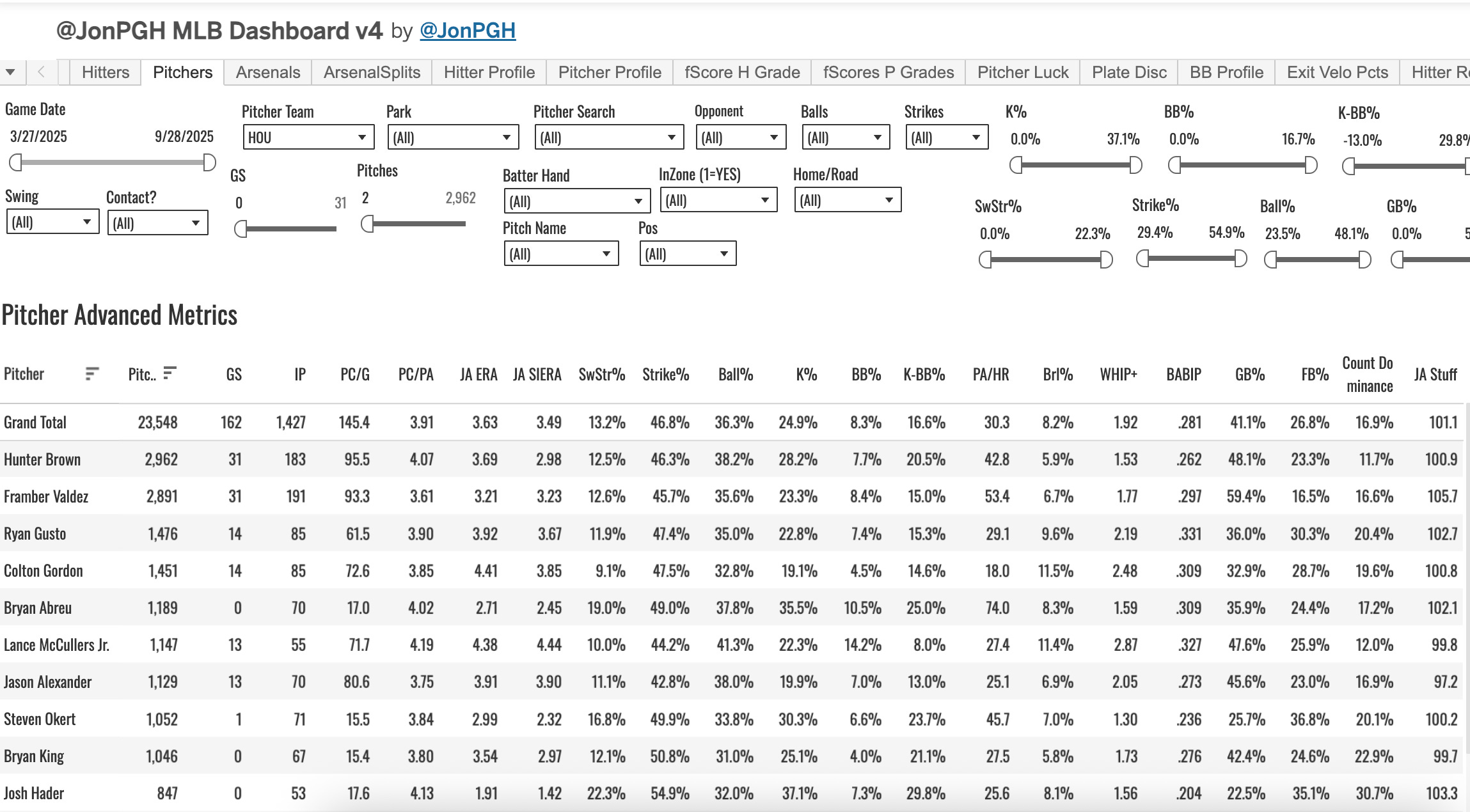
The Grand Total line will always be the averages (if it’s a calculated field, meaning if it’s a number generated from division or any sort of calculation) or sums (in the case of individual numbers like starts or innings).
So you can see that Brown shows up in the first row below the totals, as he led the team in pitches thrown last year, which is the default sort method. But you can sort by anything you want.
Some of the filter criteria you have at your finger tips:
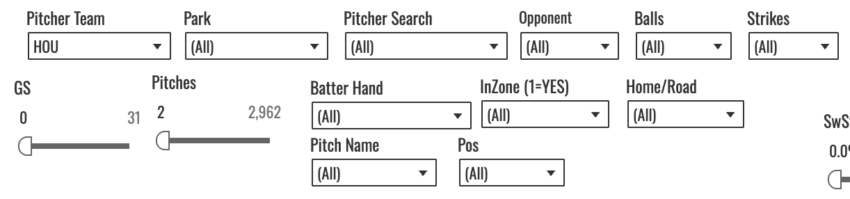
So you can see how he did at home, how he did in a certain other park, how he did against a certain team, against a certain batter hand, when his pitches were in the zone (1 will always mean YES and 0 will always mean NO). Or you can select a pitch type, and the numbers will all change to reflect results only on that pitch. Let’s show that:
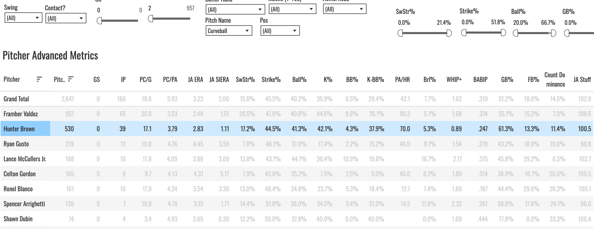
You immediately see how tough the pitch was on hitters. It wasn’t a strike at a high rate (41% Ball%), but that’s not abnormal for a curveball, and the 70 PA/HR, 5.3% Brl%, 0.89 WHIP+ (read about that here) show you that pretty much the best the hitters could hope for would be for one of those balls to be called when they saw the pitch. They were not hitting it very well.
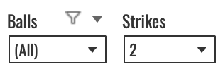
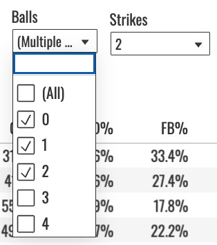
There are dozens of different filters and combinations of filters you can do here, but one more for this tab: the balls & strikes dropdowns. One thing I’ve noticed about Brown is how good he was at putting dudes away when he got to two strikes. For this example, I’ve set the strikes to two, and left everything else alone.
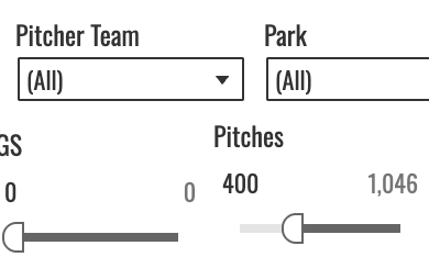
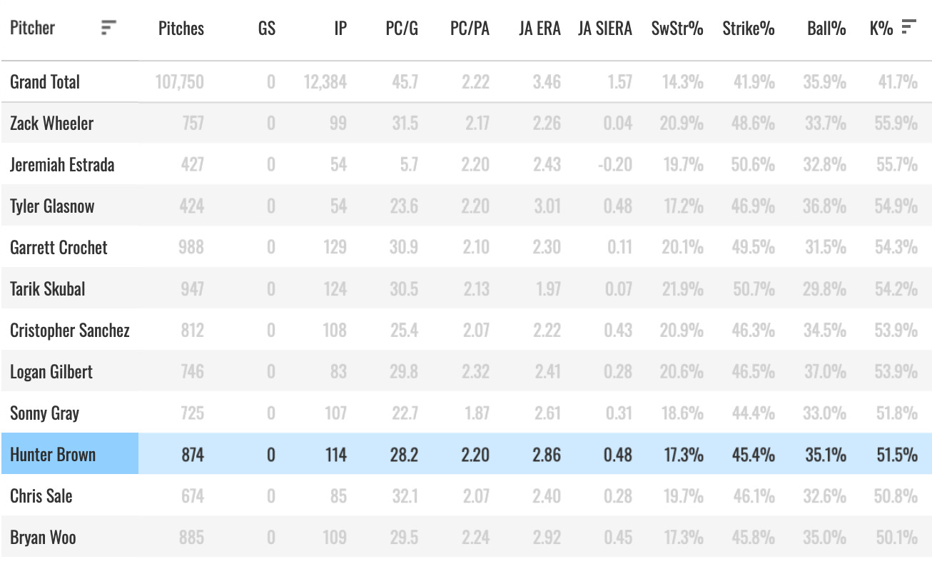
We see Brown’s K% change to 51.5%! The interpretation of that would be, when a plate appearance ended on a pitch thrown by Hunter Brown in two strike counts, 51.5% of the time that PA ended with a strikeout. But it’s hard to know if that’s good or not. I mean it sounds good, but is it? So I took the team filter off and set a minimum pitch count to 400 to check how the rest of the league did in that same situation and where Brown’s 51.5% mark ranked.
We see the Grand Total K% show up as 41.7%, which reflects the league average in the situation you’ve chosen. And we see Brown lining up 9th-best in baseball:
And then you could go through and pick whatever count you wanted and see the numbers. Rinse, wash, repeat. You can spend all day on this dashboard.
The Arsenals Tab
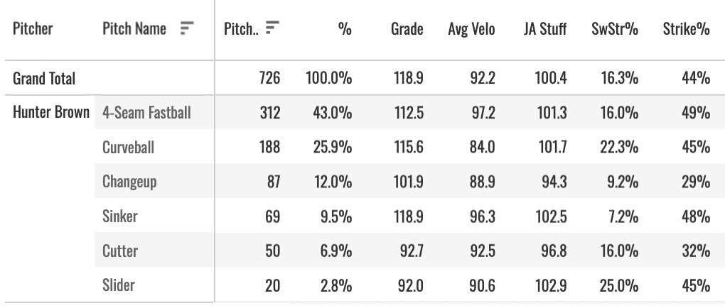
This is the third tab you’ll see, and it’s the place to go if you want to see the breakdown of a guy’s pitch mix. Here’s what it looks like:
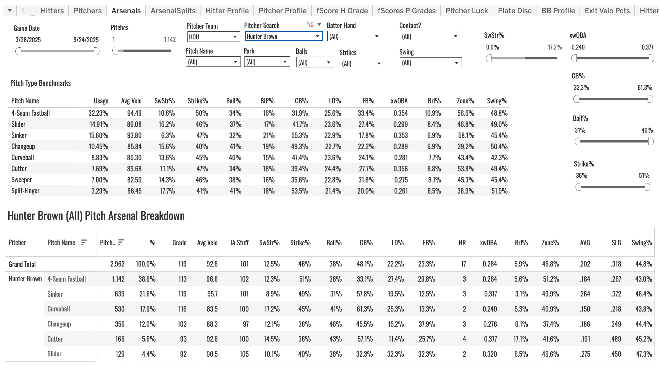
You have your benchmarks table there at the top. Which kinda gets in the way, but it’s important to have the numbers to compare to. What you have in that table is the league averages for each pitch type.
And those general averages are important to know. Because different pitch types are different. The 12.3% SwStr% on Brown’s four-seamer looks a lot better when you see the league average four-seamer is at 10.6%. And the 45% Strike% (whiffs + called strikes + fouls divided by pitches) looks a lot better when you see the league averaging before five points lower.
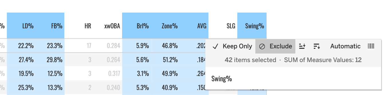
It’s a wide table of data, an dI think the columns are all self-explanatory. One thing to note, you can hide columns if you want:
The Grade column is my own MLB DW special formula, and you can read more about that here. But 100 = average. So you can get a really quick feel for how good a pitch was last year with that individual number:
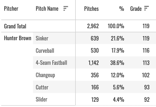
The grand total in that case should be ignored. It’s just going to show you the maximum of the numbers below, which is not useful.
You can do filtering on this data as well, just like we talked about with the main pitchers tab.
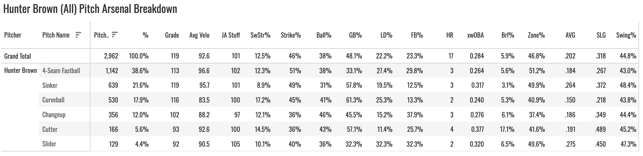
Want to see how Brown attacked while being way ahead in the count? Set strikes = 2 and balls to 0, 1, or 2:
The numbers change (pitch grades don’t, those are static, one grade for the entire year):
No surprise, we see Brown going away from the sinker and going heavier to the four-seamer and curve, his more effective whiff-getting pitches.
You can (and very often should) split all of that by hitter handedness as well. There’s a tab right next to this one called Arsenal Splits, that does mostly the same thing but splits the table (and gets rid of some columns for space-saving purposes) by batter hand:
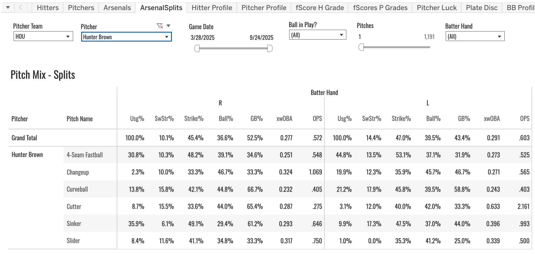
A quick, single-screen way to see how a guy attacks both sides of the plate. In this case, you can see how different it is. He’s SI/FF/CU to righties and FF/CU/CH to lefties.
The Pitcher Luck Tab
Luck is a big part of the game, and they’re always very good numbers to know when trying to figure out the future for a given SP. So I have a Pitcher Luck tab to break that down for you.
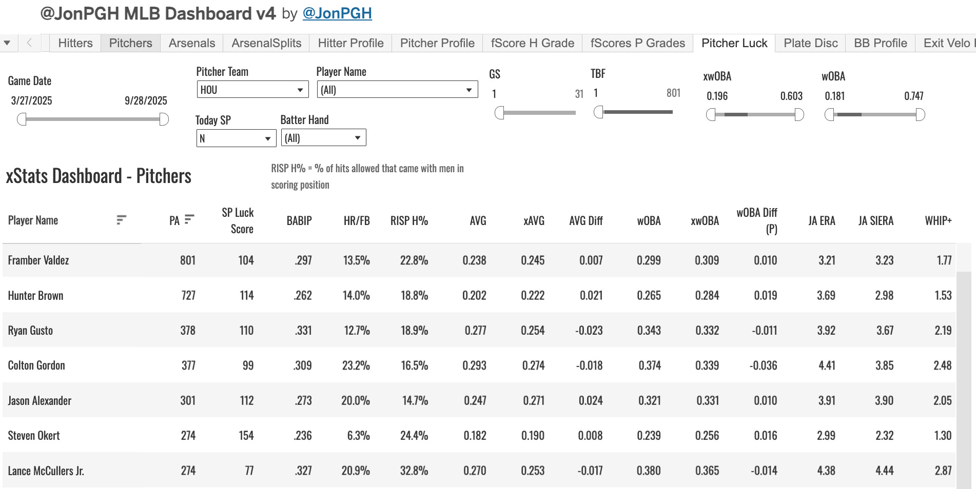
I filtered it to the Astros. We show BABIP, HR/FB, RISP H% (my version of LOB%), and then the xStats (AVG and wOBA) and the differences between them. And we throw on JA ERA, JA SIERA, and WHIP+ just to have there.
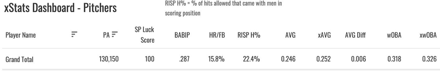
You’ll have to know the league averages for these to make sense, but as always you can see them on the Grand Total row when you have no filters applied.
For Hunter Brown then:
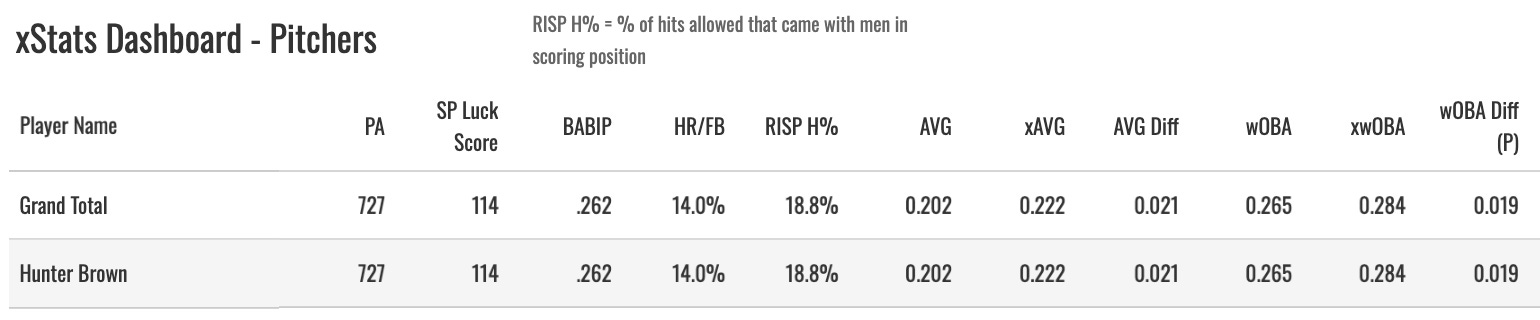
We’d notice an AVG 20 points below the xBA, a wOBA allowed 20 points below the expectation as well. A 14% HR/FB, which was slightly lower than average, an 18.8% RISP H%, also slightly lower than average, and a .262 BABIP, 26 points below average.
The pitcher is in some control of these things. But they’re good to know. You’re not going to consistently crush the league averages in these things. Brown had a pretty fortunate season, we’d say.
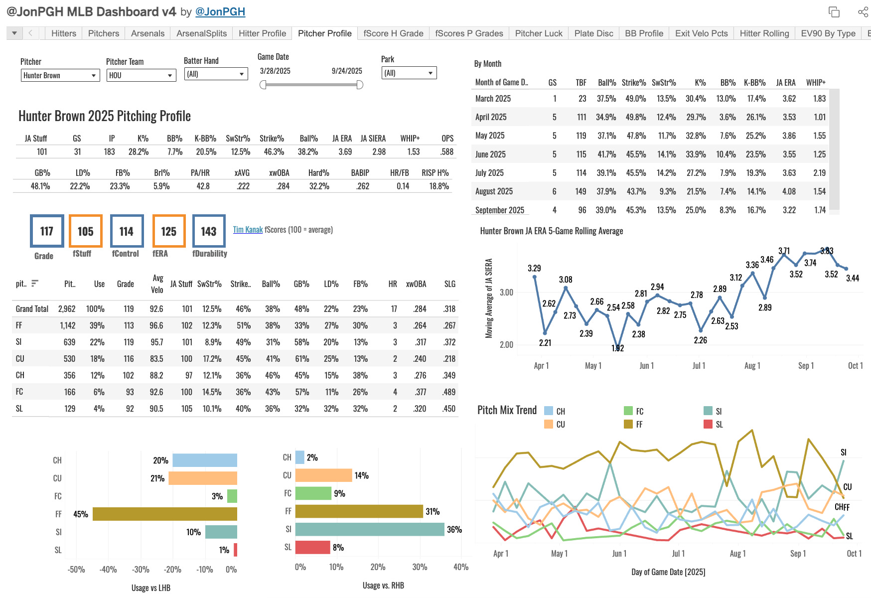
Pitcher Profile Tab
There are many, many more tabs and plots with pitching data on them. But we’re going through the highlights here, as I said. And the main points are all beautifully assorted onto the Pitcher Profile tab.
It has pretty much everything we’ve already gone through and more. A rolling JA ERA plot (five appearance rolling average), a graph of their pitch mix usage, fastball velo trends, game logs, hitter splits, the fScores, stats by month, and a few other things.
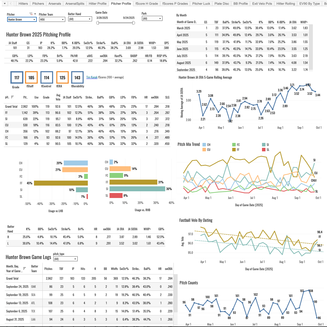
It’s tough to see in that screenshot, because it’s a big dashboard. Everything I look for initially with a pitcher has been put on there, just so we have a one-stop shop to quickly get what we need. It’s probably my most-visited tab.
That’s it for this post. It would take like 15 of these posts to cover everything on that dashboard. So subscribe today, bookmark that link, and get in there and click around. Leave your questions below or ask me in the members Discord.